
Colours and patterns on Hebel noise walls provide a sense of place for motorists
There’s a lot more to Hebel’s motorway noise walls than meets the eyes of the people travelling past them.
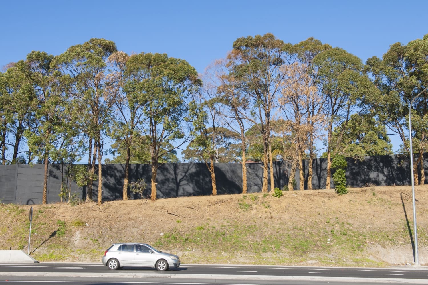
In addition to reducing noise levels and offering high fire resistance, the walls are designed to assist motorists by reducing visual monotony and providing a recognisable identity and character for various road sections. This, in turn, helps to give people a sense of place as they travel along the motorways.
For example, the recent installation of Hebel SoundBarrier panels on sections of Sydney’s M4 Motorway involved close collaboration between Hebel and Mary Anne McGirr, Urban and Landscape Design Principal for DesignInc Sydney.
Mary Anne led the DesignInc team that worked with Hebel on designing the noise barriers for the M4 WestConnex Widening Project which is part of the overall WestConnex undertaking. She previously worked with Hebel on designing the noise walls on the Hills M2 Motorway upgrade, including the striking orange section that is well known to motorists using the road.
Wall colours serve specific functions
For the DesignInc team, the colour and patterning of the noise walls were major considerations, with three colours selected for various sections and to serve specific functions.
“Motorways are designed to be very safe but they can also be monotonous,” said Mary Anne. “Because of this, we see such structures as the noise walls as an opportunity to provide more legibility for motorists.”
In locations where a pronounced visual effect was deemed appropriate, the designers were able to give free rein to their creativity.
“While some of the walls serve as a backdrop to the vegetation or landscape and weren’t designed to stand out, there were other walls where we used bright colour intentionally,” said Mary Anne. “The colours and the patterns help to give the road more identity and provide motorists with a sense of place. For example, people will find it easier to recognise when they are at the Silverwater Road interchange because of the bright colour and patterns of the noise walls in that area.”
Native flower provided inspiration
The colour selected for the M4 walls in areas such as the interchange, and the Parramatta entry and exit locations, is the violet of a native flower of the Cumberland Plain woodland ecological community, known as Hardenbergia Violacea or Native Sarsaparilla.
“We wanted to come up with a colour that would link with the surrounding landscape as well as creating a sense of place and legibility in the areas where it was used,” said Mary Anne.
In other areas, colours were used to minimise the visual impact of the walls.
“Off the motorway we wanted to de-emphasise the walls and reduce their visual impact for nearby residents, so we used a neutral grey colour,” said Mary Anne.
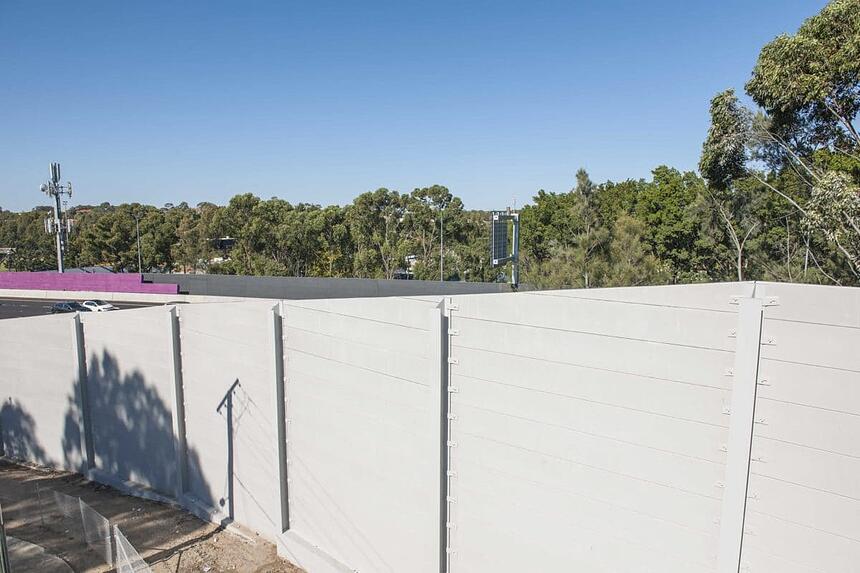
A charcoal grey, designed to subtly underscore the natural greens of native vegetation, was used in other areas of the motorway and on off-road sides of the noise walls, also to lessen their visual impact.
Some of the noise walls on the motorway were also patterned with the aim of adding to the sense of place.
“We needed a pattern that we could keep repeating on the panels so that it could be matched from one bay to the next, between the posts,” said Mary Anne. “We came up with a very simple routed horizontal groove pattern which added an additional element to break down the look of the larger 600ml high panels and also created a visual flowing line to convey the sense of the flow of traffic.”

Subscribe to Hebel Matters.
To stay up to date with the latest Hebel news, articles and feature projects, enter your email to sign up to our monthly e-newsletter.
Subscribe